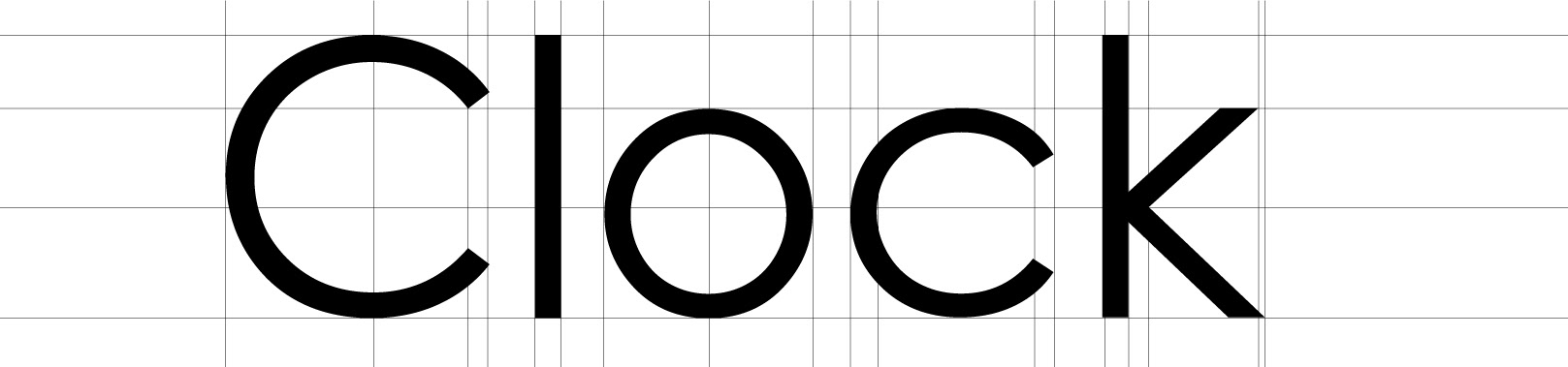
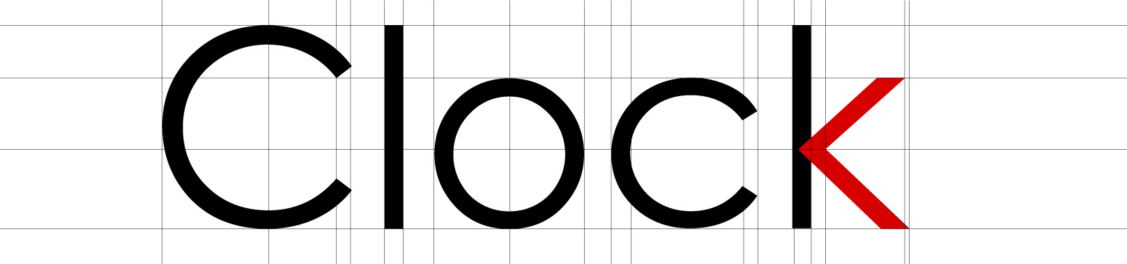
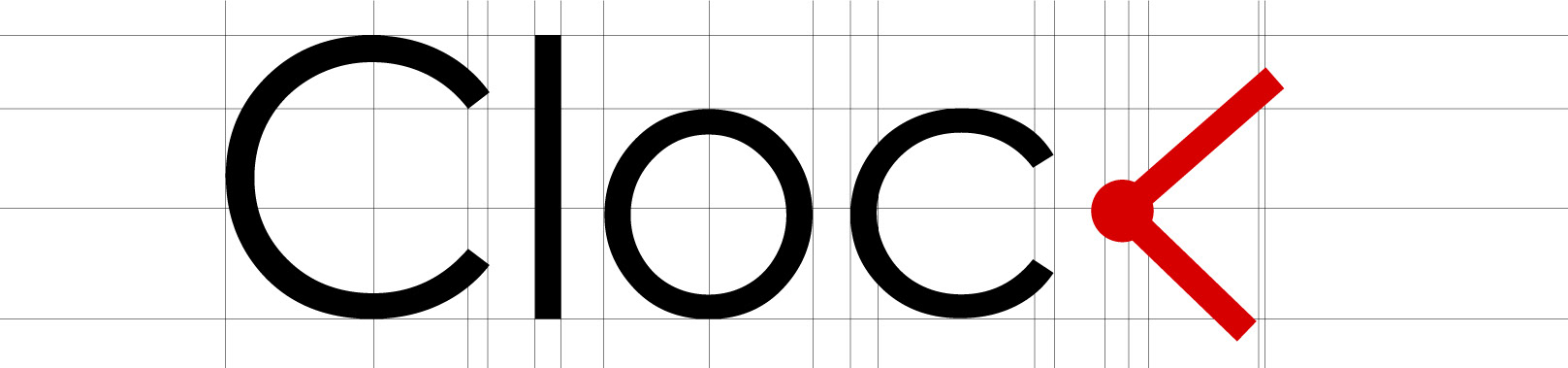
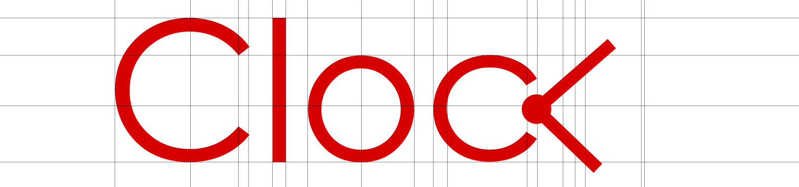
I started with a simple and clean typography to represent simplicity of the concept. Clock represents the fast pace life of urban people. Actually Clock plays with the time in their menu ( I am still working on it. I will upload it as soon I finish it), for example, coffee latte is a minute latte so the slogan is encouraging people to take a coffee
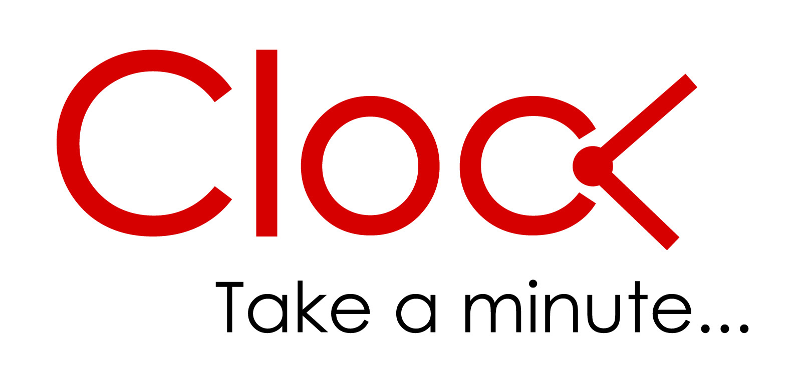
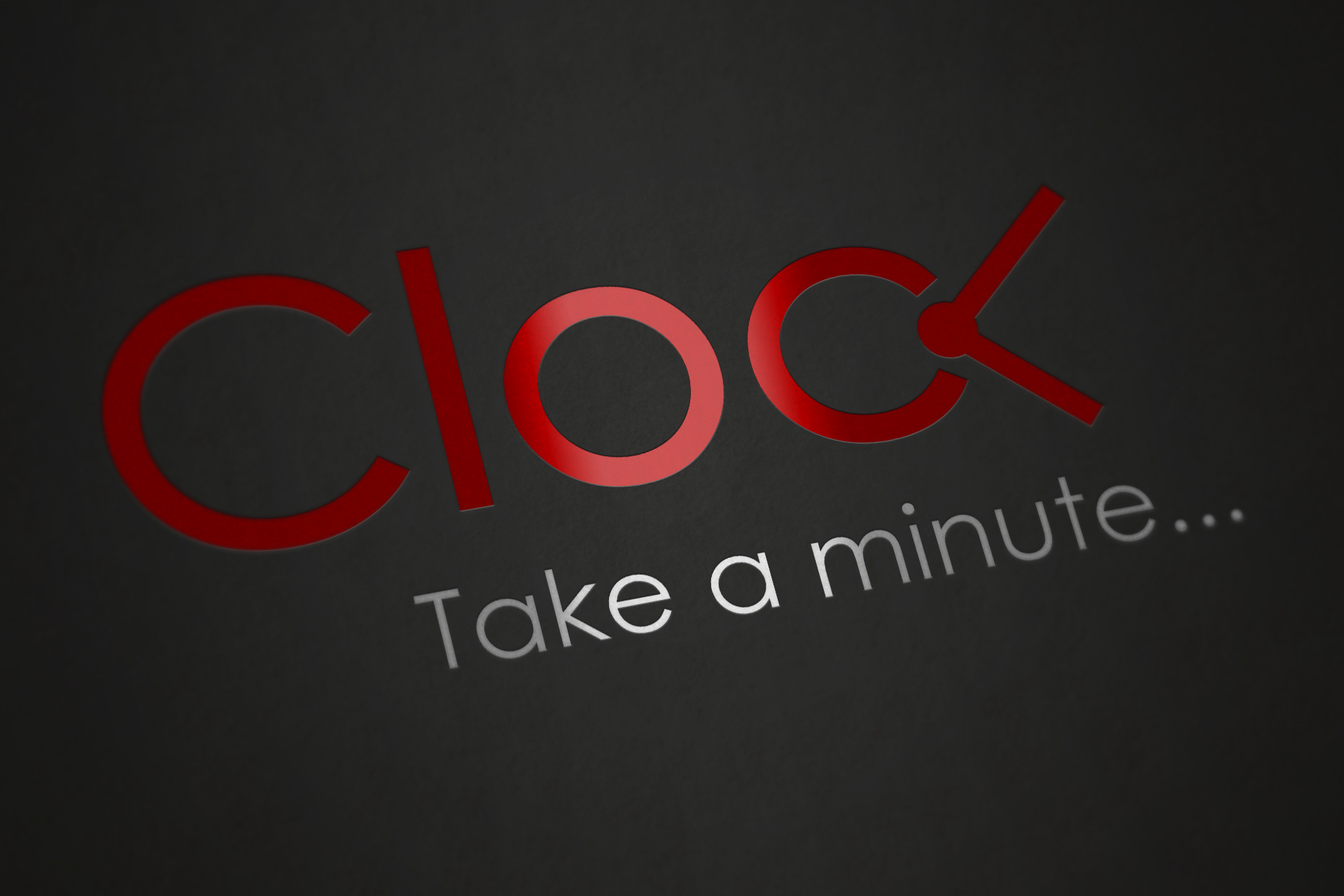
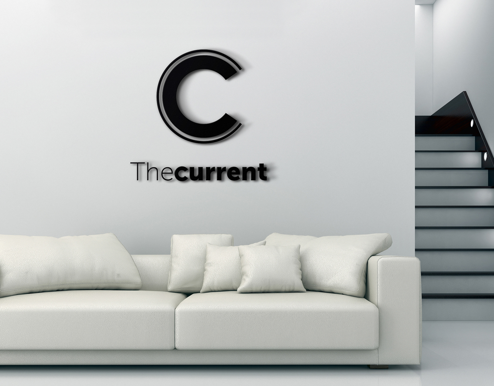
Final logo.
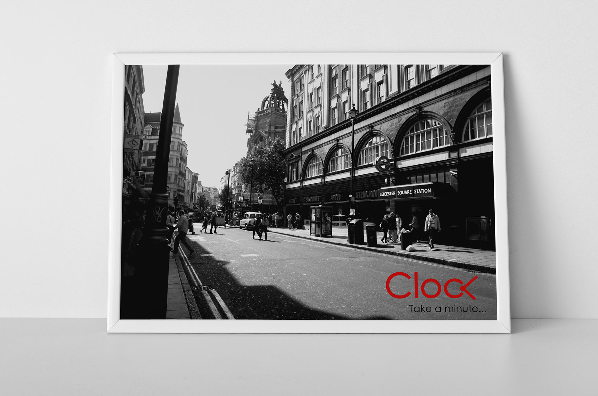
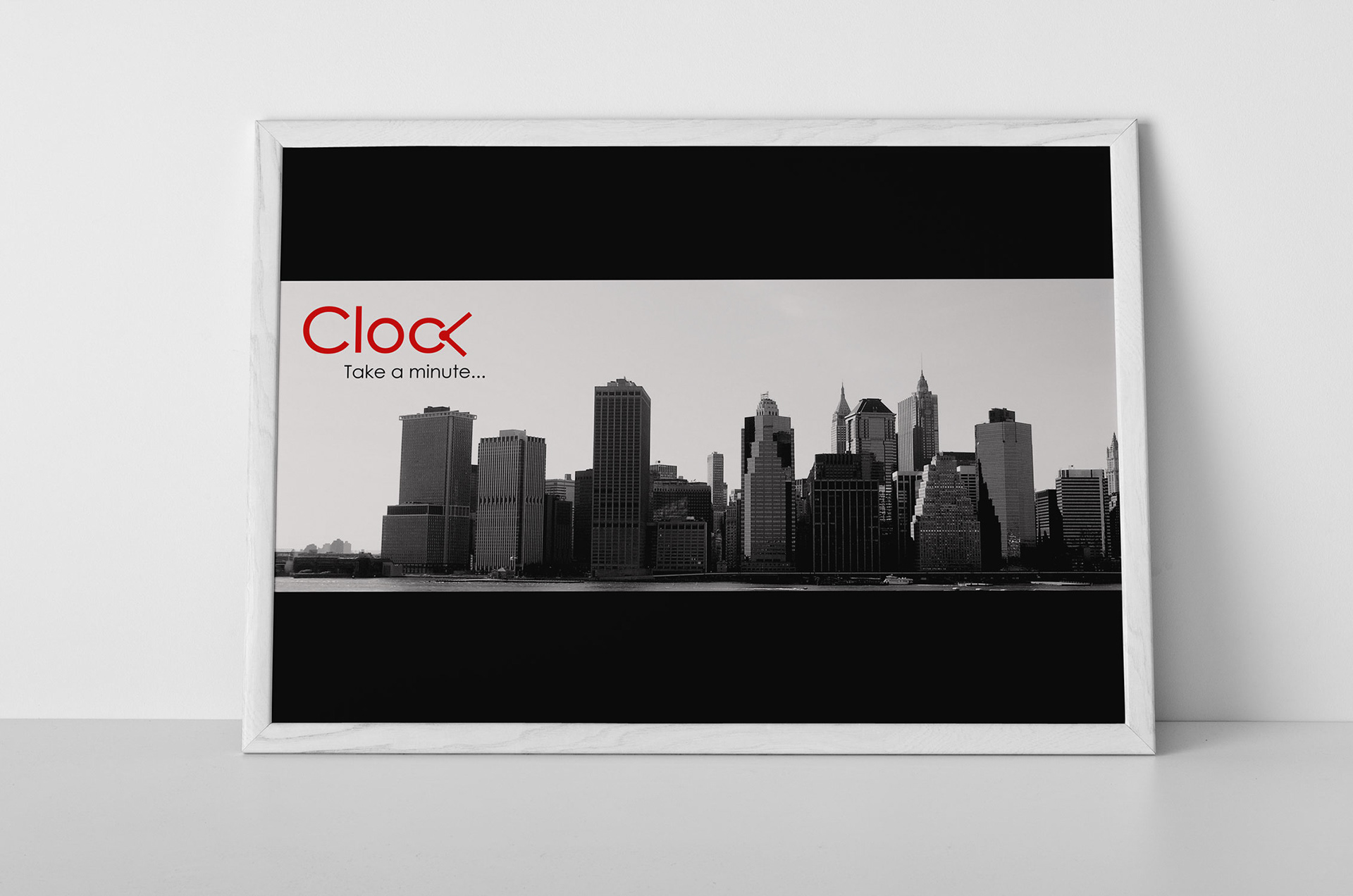
A few prints for decoration of the stores and graphic ads.